How to Create Eye Catching Package Stickers for Your Products?
Creating eye-catching package stickers is essential for product branding. As packaging expert Sarah Johnson notes, "Your stickers tell a story before the product does." This highlights how package stickers can capture attention and convey messages quickly.
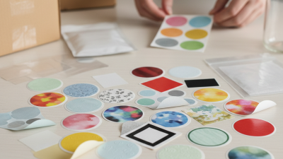
Innovative designs, vibrant colors, and clear messaging are key. Ensure that your stickers reflect your brand’s identity. Discovering the right balance can be a challenge. Some designs may look good but fail to connect with customers. Experimenting with materials and finishes can add a unique touch.
Remember, package stickers should enhance the product, not overwhelm it. Analyze customer feedback and make adjustments accordingly. Not every design will resonate. Learning from mistakes is part of the process. Consider what elements draw the eye and keep the focus on your product.
Understanding the Importance of Package Stickers for Branding
Package stickers play a crucial role in branding. They serve as visual cues that attract potential customers. Instead of just being decorative, these stickers communicate your brand's identity. A well-designed sticker can make a significant impact on how your product is perceived.
Consider the colors, fonts, and images you use. These elements should reflect your brand's personality. Bright colors can draw attention, while muted tones may suggest sophistication. Your choice of material also matters; a matte finish can feel premium, while glossy stickers might look more playful. Each detail counts. Yet, many overlook the importance of clarity. If potential buyers cannot read your message, the design fails.
Mistakes in sticker design are common. Some stick to trends without considering their audience. This can lead to confusion and alienation. Reflecting on your design choices is essential. Look beyond aesthetics and focus on communication. An effective sticker should tell your brand's story in a glance.
How to Create Eye Catching Package Stickers for Your Products? - Understanding the Importance of Package Stickers for Branding
| Sticker Type |
Material |
Size (inches) |
Finish |
Purpose |
| Logo Stickers |
Vinyl |
3 x 3 |
Glossy |
Brand Recognition |
| Product Label Stickers |
Paper |
5 x 3 |
Matte |
Informational |
| Promotional Stickers |
Glossy Paper |
4 x 4 |
Glossy |
Marketing Promotion |
| Eco-Friendly Stickers |
Recycled Paper |
2 x 2 |
Natural |
Sustainability Focus |
| Seasonal Stickers |
Vinyl |
6 x 2 |
Glossy |
Themed Promotions |
Choosing the Right Materials and Printing Techniques for Stickers
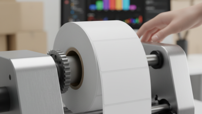
When creating package stickers, selecting the right materials and printing techniques is crucial. Vinyl is often preferred due to its durability and resistance to water and UV rays. A recent report by the Specialty Printing Industry Association indicates that 40% of businesses prioritize durable materials for product labels. This data shows that investing in high-quality materials enhances the longevity of stickers, making them more effective.
Tip: Always consider the environment. Eco-friendly materials, like biodegradable vinyl, are gaining traction. They appeal to an environmentally conscious consumer base. A study found that about 60% of consumers feel more positively about brands that use sustainable packaging.
Printing techniques also play a significant role. Digital printing is popular due to its flexibility and capability for small runs. However, it may lag behind offset printing in color vibrancy. Exploring options can help find the perfect balance. Remember, the sticker's finish, whether matte or glossy, impacts its visibility and tactile appeal.
Tip: Test various finishes on a small scale. Gathering feedback can highlight what resonates best with your audience. This iterative process can refine your designs based on actual consumer preferences. Keep experimenting, and embrace imperfections to find unique perspectives that stand out in the market.
Design Principles for Creating Visually Appealing Package Stickers
Creating visually appealing package stickers involves thoughtful design principles. An effective sticker can enhance brand recognition and influence purchasing decisions. According to a report by the Packaging Association, about 72% of consumers judge a product by its packaging before making a purchase. This statistic underscores the importance of aesthetics in design.
Color is a critical element. It conveys emotions and can attract attention. Research shows that specific colors can trigger different feelings, impacting consumer behavior. For instance, blue evokes trust, while red can stimulate excitement. However, keep in mind that overuse of colors can lead to confusion. A balanced palette with a dominant color, supported by complementary shades, often works best.
Typography also plays a significant role in sticker design. It should be legible and reflect your brand’s personality. Studies indicate that 90% of information transmitted to the brain is visual. Thus, incorporating unique yet readable fonts can help in forging a connection with the audience. That said, using too many fonts can detract from the overall message. Reflection on your design choices is crucial; sometimes less is more, leading to a cleaner and more effective visual message.
Incorporating Brand Identity and Messaging in Your Sticker Design
Creating eye-catching package stickers starts with a deep understanding of your brand identity. Your stickers should reflect your brand's values, colors, and typography. Consider the emotions you want to evoke in your customers. Whether it’s excitement, nostalgia, or trust, your design plays a crucial role. Choose colors that not only stand out but also align with your brand's message.
Incorporating messaging is equally important. Clear and concise text can enhance your design. Use simple phrases that resonate with your audience. Try keywords that convey your product's benefits. Think about what differentiates your product from others. This can guide your wording effectively. Allow your stickers to tell a story, even if it's just a small part of your overall branding.
This process isn't always perfect. Sometimes the initial designs fall flat. Feedback from real customers is essential for improvement. Prototype different designs and gather opinions. What looks good in theory may not connect with your audience. Embrace this iterative journey to refine your stickers. This is the key to creating something truly remarkable.
Product Sticker Design Elements Analysis
Tips for Effective Placement and Application of Package Stickers
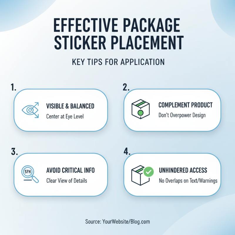
When designing package stickers, placement is crucial. Stickers should be easy to spot but not overpower the product design. Position them at eye level on the package. Centering the sticker can create a balanced look. Avoid placing stickers over important information, such as ingredients or safety warnings. A clear, unobstructed view allows consumers to read essential details.
Application techniques also matter. Ensure the surface is clean and dry before applying the sticker. A smooth application prevents air bubbles. Stickers can lift or peel off if not applied correctly. Test a few placements beforehand to find the best position. Layered designs can be appealing but may complicate the messaging. Keep the design simple and relatable, so it resonates with your audience.
Review the customer feedback on sticker designs. Sometimes, what seems attractive may not translate well in the real world. Adjust designs based on reviews or sales data, as this reflects how consumers interact with your product. Constantly revisiting your sticker placement strategy can lead to better connections with your customers.